Evaluate how your own space is affecting your sense of calm.
The Calm Space Audit gives you a visual reading of one room photo, including a Calm Space Score, nervous-system-informed reflection, and 3 gentle refinements.
Public beta. Your uploaded photo is used only to generate your result and is not stored.
What This Art Is and Is Not
Is this art a replacement for therapy or medical treatment?
No. Recalibrate & Exhale art is designed to be supportive, but it is not therapy and it is not medical care. If you’re experiencing significant distress, persistent symptoms, or you’re unsure what you need, the safest next step is to speak with a qualified health professional.
Ethical note: This art can be a gentle part of your environment, but it does not diagnose, treat, or cure mental or physical health conditions.
How should I think about the benefits?
Think of it like designing the “emotional acoustics” of a room. Some imagery can feel visually loud; other imagery can feel visually quiet. R&E pieces are created to be visually soft and spacious, so your eyes have somewhere calm to land.
People often describe effects like: feeling more settled in the room, fewer “jagged edges” after a demanding day, and easier transitions between tasks. These experiences vary from person to person, and they’re best understood as supportive—rather than guaranteed outcomes.
Can I use it alongside other therapeutic approaches?
Yes. Many people use calming visual anchors alongside what already helps them—therapy, mindfulness, breathwork, somatic practices, good sleep habits, medication as prescribed, and supportive routines.
If you’re working with a therapist, you can also treat the art as a gentle “co-regulation” tool in the space: something steady, neutral, and non-demanding that supports a calmer baseline.
Where this approach is most helpful
homes designed for calm and restoration
therapy and clinical environments
workspaces requiring sustained focus
children’s environments needing reduced stimulation
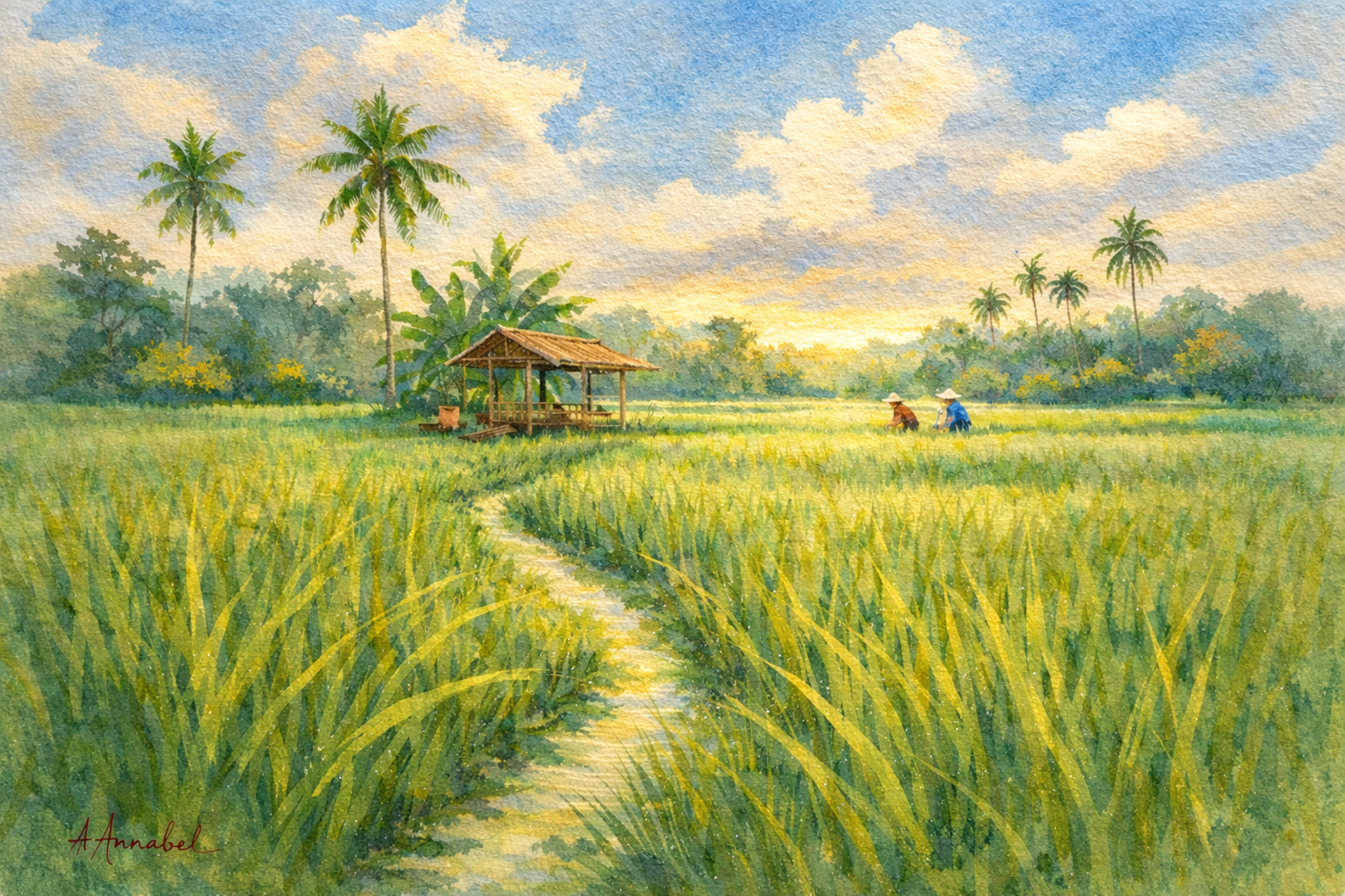
A calming Bali rice field wall art print designed to bring softness and visual stillness into your space.
Gentle green tones and open composition reduce visual noise, allowing the eyes to rest and the nervous system to settle.
Ideal for bedrooms, therapy rooms, and quiet living spaces where a sense of calm and mental clarity is desired.
Soft emerald and olive tones blend with light sky blues, with subtle movement across the field to create a sense of calm continuity rather than visual demand.
This loose contemporary watercolor captures the gentle movement of a Bali rice field under soft tropical light. Flowing blades of rice sway across the foreground in layered greens, while distant palms and a simple bamboo shelter sit quietly against a luminous sky.
Two small figures work slowly in the field — a reminder of the steady, grounded pace of rural life.
The composition intentionally creates visual breathing space: soft edges, natural colour transitions, and open sky allow the eyes to settle rather than search. A subtle path curves through the rice plants, guiding the gaze toward the horizon where warm light touches the landscape.
This type of scene mirrors many of the elements associated with visually restorative environments:
• natural colour palettes
• gentle visual flow
• moderate detail without clutter
• expansive horizon lines
The result is an image that feels calm, spacious, and grounded — a visual pause within a room.
Ideal for spaces where quiet atmosphere matters:
• living rooms
• reading corners
• bedrooms
• therapy or consultation rooms
• coastal or tropical interiors
A soft landscape designed to bring the nervous system a moment of rest.
Digital Download
Instant access after purchase
High-resolution file suitable for printing
Print at home or through a professional service
You will receive high-resolution digital files sized for popular print formats, so you can print and frame the piece at a scale that suits your space and printing options up to 50×70cm.
See Shipping & Returns for details.
Learn how visual environments affect your nervous system
👉 Science of Art Guide
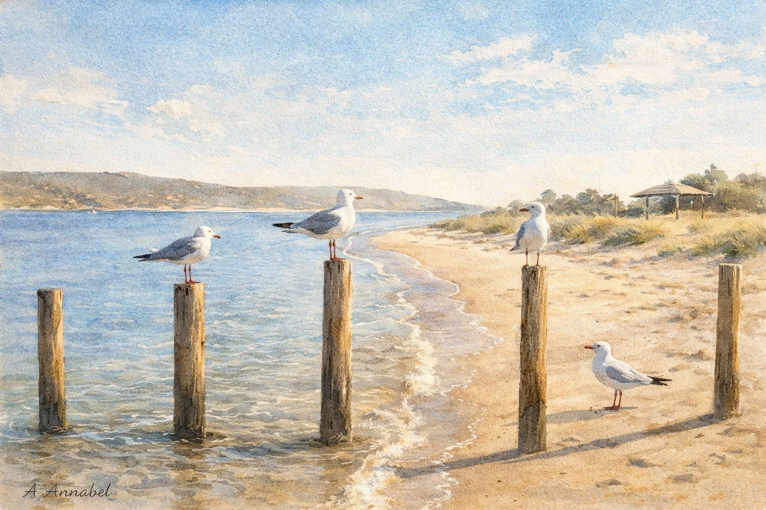
Seagulls at the beach is a peaceful coastal artwork capturing a small group of seagulls resting quietly along the water’s edge. Balanced on weathered posts and soft sand, the birds appear unhurried and self-contained, as gentle waves trace the shoreline behind them. The open sky and curved coastline create a sense of space, breath, and quiet continuity.
The softened brushwork and muted coastal palette are designed to be visually regulating rather than stimulating. Warm sands, pale blues, and natural greys work together to reduce visual noise, allowing the eye to settle without searching for detail. The composition invites a slower pace — the kind of moment where nothing needs to happen, and simply observing is enough.
Designed for visual calm
Created with soft tonal transitions and reduced visual complexity, this artwork is intended to sit gently within a space—supporting a more settled visual environment rather than competing for attention.
Digital Download
Instant access after purchase
High-resolution file suitable for printing
You will receive high-resolution digital files sized for popular print formats, so you can print and frame the piece at a scale that suits your space and printing options up to 50×70cm.
See Shipping & Returns for details.
Where this piece fits
Ideal for:
Bedrooms and restful spaces
Living areas seeking softness
Children’s rooms
Therapy or consultation environments
Important information
This artwork is for personal use only (see Terms for licence details)
Colours may vary slightly depending on screen and print settings
Digital products are non-refundable once downloaded
A considered approach
This work is informed by an understanding of how visual environments can influence the nervous system.
It is not a medical or therapeutic product, but a gentle, intentional addition to your space.
For full details, please see:
Shipping Policy
Returns & Refunds
Terms of Service
“Want more like this? See the Water Themes Collection ”
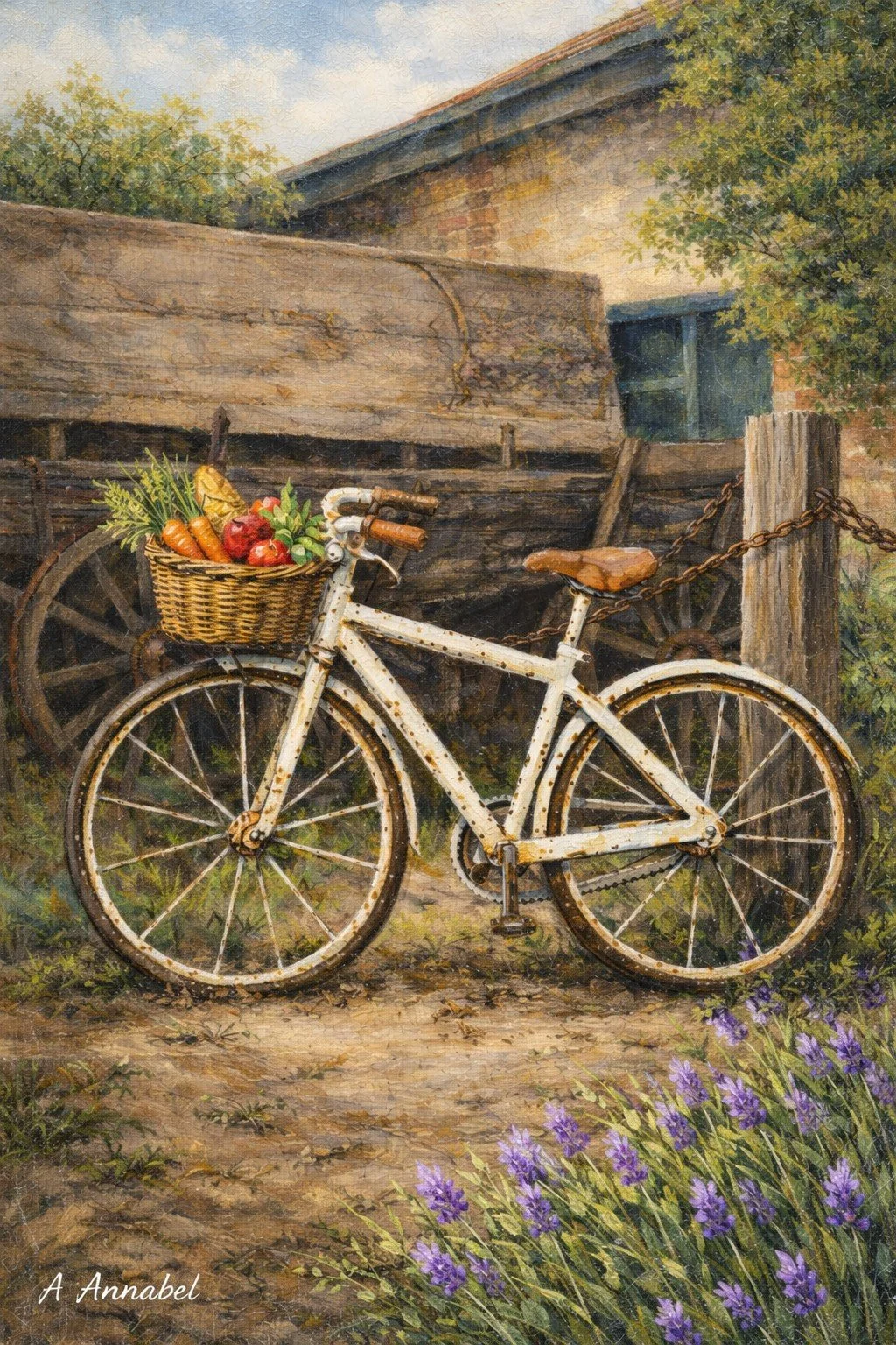
Lavender Lane is a gently nostalgic artwork featuring a weathered white bicycle resting against a timber fence in a quiet rural setting. A basket of fresh produce, a softly aged building, and a hint of purple lavender in the foreground create a scene that feels both grounded and tender — a moment where time slows and small details are allowed to matter.
The loose brushwork and softened edges are designed to be visually calming rather than stimulating. Subtle contrast, warm neutrals, and natural greens create a sense of steadiness, while the lavender introduces a gentle focal note of colour. The overall effect is one of quiet reflection — the kind of image that invites an unhurried breath and a sense of being held by familiar, simple surroundings.
This piece is well suited to spaces where comfort and emotional ease matter: living rooms, bedrooms, reading corners, counselling or therapy rooms, and calm workspaces. It pairs beautifully with timber, linen, stone, and other natural textures.
You will receive both watercolour and oil-style versions of the artwork in high-resolution digital files, formatted for popular frame ratios up to 50×70cm so you can print locally or through your preferred professional service. Print at home for small pieces or scale up for statement wall art, choosing the paper and finish that best suit your space.
Digital Download
Instant access after purchase
High-resolution file suitable for printing
Print at home or through a professional service
You will receive high-resolution digital files sized for popular print formats, so you can print and frame the piece at a scale that suits your space and printing options up to 50×70cm.
See Shipping & Returns for details.
“Want more like this? See the Water Themes Collection ”
Learn more about how visual environments affect stress in our 👉 Science behind Calm PDF (Free)
There’s real science describing the impact of art in reducing nervous system load.
The Science of Calm Spaces
Our environments shape how our nervous system responds.
Even when a space appears visually “beautiful,” high contrast, dense detail, and constant visual input can quietly increase cognitive load.
This work explores a different approach — creating visual environments that allow the mind to settle rather than continuously process.
Further reading
How Recalibrate & Exhale Pieces Are Designed
Colour:
Colour is chosen for nervous-system friendliness: soft transitions, low visual “alarm,” and tones that feel breathable in real rooms (not just on screens).
Low-to-mid saturation to reduce visual strain.
Harmonised palettes (blues, sand, greens, warm neutrals) to support ease.
Gentle contrast so the eye can settle rather than scan.
Composition & Space:
Composition is designed to create a sense of steadiness. I use clear structure and “resting places” for the eyes—so you can rest and wander slowly, preventing the visual jolts associated wth cluttered compositions.
Breathing space (sky, water, negative space) to lower visual load.
Balanced focal points that guide attention without demanding it.
Calm geometry (horizons, curves, natural framing) for quiet order.
Subject Matter:
Subject matter is selected for familiarity and safety—everyday moments in stillness, simple moments that feel reassuring, not activating. I have added some special mens shed options for those that enjoy retro charm.
Coastal and natural landscapes (water, trees, open horizons).
Everyday calm (paths, jetties, quiet edges of a day).
No harsh intensity—we avoid imagery that feels sharp, crowded, or confrontational.
Texture & Style / Emotional Intention:
The style is intentionally soft creating a slightly nostalgic and gentle feel, supporting memories of slower, less crowded times. Texture is used to create warmth and human presence—without visual noise.
Soft edges and gentle gradients (less “fight or flight” visual energy).
Painterly texture that feels grounding rather than glossy.
Emotional aim: steady, spacious, quietly premium calm
Every piece is designed to be lived with—art that supports regulation, not stimulation.How to Use This Art in Your Space:
Home Spaces
Designed to make rooms feel calmer without changing your whole life—just the emotional tone of the space.
Living room: above sofa/console to create a visual “downshift” zone
Bedroom: opposite the bed for the last/first thing your eyes meet—soft, non-demanding imagery
WFH / study: beside your screen to give your eyes a restorative place to land between tasks
Pair with warm neutrals, timber, linen, and soft lighting for best effect
Micro-Reset Rituals
Small ways to use the art as a cue for calm—especially on high-demand days.
60-second gaze reset: soften your eyes, slow your exhale, and let attention rest on one quiet area of the image
Transition cue: look at the piece for three breaths when moving from work mode to home mode
Name what you notice: “waterline, light, space” — simple language that brings your system back to the present
Therapy & Counselling Rooms
Use R&E pieces to support a sense of safety and gentle focus—especially in the first minutes of a session.
Hang within the client’s soft gaze line: adjacent to seating, not directly behind you
Choose open horizon pieces for grounding during anxiety, overwhelm, or trauma work
Use nature-forward images as a neutral “third object” that reduces intensity in the room
Place in waiting areas to ease anticipatory stress and soften transition into therapy
.
Why visual environments matter
The brain is constantly scanning and interpreting what we see.
Busy or high-stimulation environments can:
increase cognitive effort
reduce the ability to rest attention
contribute to a subtle sense of overwhelm
Calmer visual environments do the opposite — they allow attention to soften and the nervous system to settle
Nature and the Nervous System
Research in environmental psychology has consistently found that exposure to natural environments—or even visual representations of nature—can support restoration from mental fatigue and reduce stress responses.
This concept is often referred to as attention restoration, where softer, less demanding visual stimuli allow the brain to recover from sustained cognitive effort.
Visual Load and Cognitive Fatigue
Highly complex, high-contrast environments can increase what is sometimes described as visual load—the amount of information the brain must process at once.
When visual input is dense or chaotic, the brain works harder to interpret it. In contrast, simpler compositions with softer transitions and reduced contrast may allow for a more settled visual experience.
How this translates into art
Each piece in Recalibrate & Exhale is intentionally designed to:
reduce visual complexity
use soft tonal transitions
create open visual space
avoid unnecessary stimulation
The goal is not to capture attention — but to give it somewhere to rest.
Colour, Tone, and Emotional Response
Colour and tonal harmony can influence emotional and physiological responses. Softer palettes, natural tones, and gradual transitions are often associated with calm, while sharp contrasts and highly saturated combinations can feel more stimulating.
Each artwork is created with a restrained palette to support a more grounded, less activating visual experience.
Recalibrate & Exhale is not positioned as a medical or therapeutic intervention. Instead, it represents a considered approach to visual design—where aesthetic choices are informed by an understanding of how environments can influence the nervous system.
The intention is simple: to create artwork that sits gently within a space, rather than competing for attention.
References & Foundations
This work is informed by research and concepts including:
Environmental psychology and attention restoration theory
Studies on nature exposure and stress reduction
Visual perception and cognitive load research
Colour psychology and emotional response
These fields continue to evolve, but collectively point toward the importance of visual environments in shaping how we feel within a space.
Founder background in psychology informs the design approach (see About page)
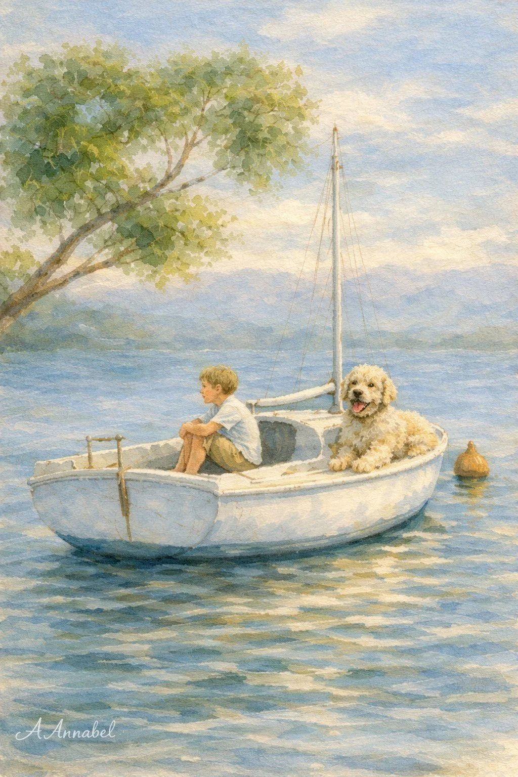
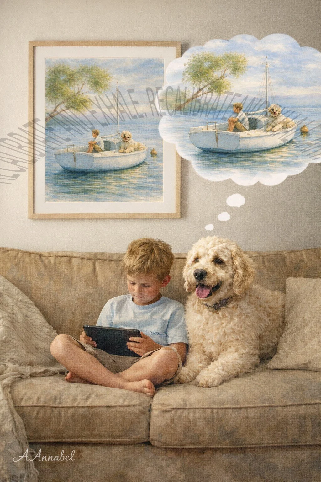
A moment of quiet connection
A boy sits beside his boat, his dog close at his side. The water is still. The world feels unhurried.
There is no urgency here — only presence, companionship, and space to breathe.
This piece is designed to bring that same sense of quiet connection into your environment, softening the visual field and allowing the nervous system to settle.
Why this artwork supports calm
This piece follows the Recalibrate & Exhale design approach:
Low visual complexity to reduce cognitive load
Soft tonal transitions that avoid visual tension
Familiar, representational imagery that the brain processes easily
Gentle spatial composition that allows the eye to rest
Together, these elements help create an environment that feels safe, predictable, and visually quiet.
Where this piece works best
This artwork is particularly suited to spaces where calm and regulation are important:
Therapy and consultation rooms
Bedrooms and restful living spaces
Quiet reading corners or retreat areas
Homes seeking a softer, less stimulating visual environment
What you receive (important)
This is a digital download. No physical item will be shipped.
Your purchase includes:
High-resolution JPG files
300 DPI for high-quality printing
Multiple aspect ratios for flexible framing
Suitable for printing up to approximately 50 × 70 cm
Files are available for instant download after purchase.
Printing your artwork
You can print your artwork:
At home using quality paper
Through a local print shop
Via an online printing service
For best results, use matte or lightly textured paper to maintain the soft, calming finish or canvas.
Designed for calm environments
Recalibrate & Exhale artworks are created to support the nervous system through low-stimulation design.
They are not therapy or medical treatment — but they are intentionally designed to shape the visual environment in a way that feels quieter, softer, and easier to be in.
Explore the science behind the work
To understand how visual environments influence stress, attention, and regulation:
→ Explore the Science of Art page
Continue exploring
If this piece resonates, you may also be drawn to other works in the collection:
👉 [View calming art collection]
👉 [Explore nature-inspired pieces]
👉 [Broader approach]
👉 {Learn more about how visual environments affect stress in our Science behind Calm PDF (Free)]
This piece was created to soften the visual nervous system load that builds throughout the day.
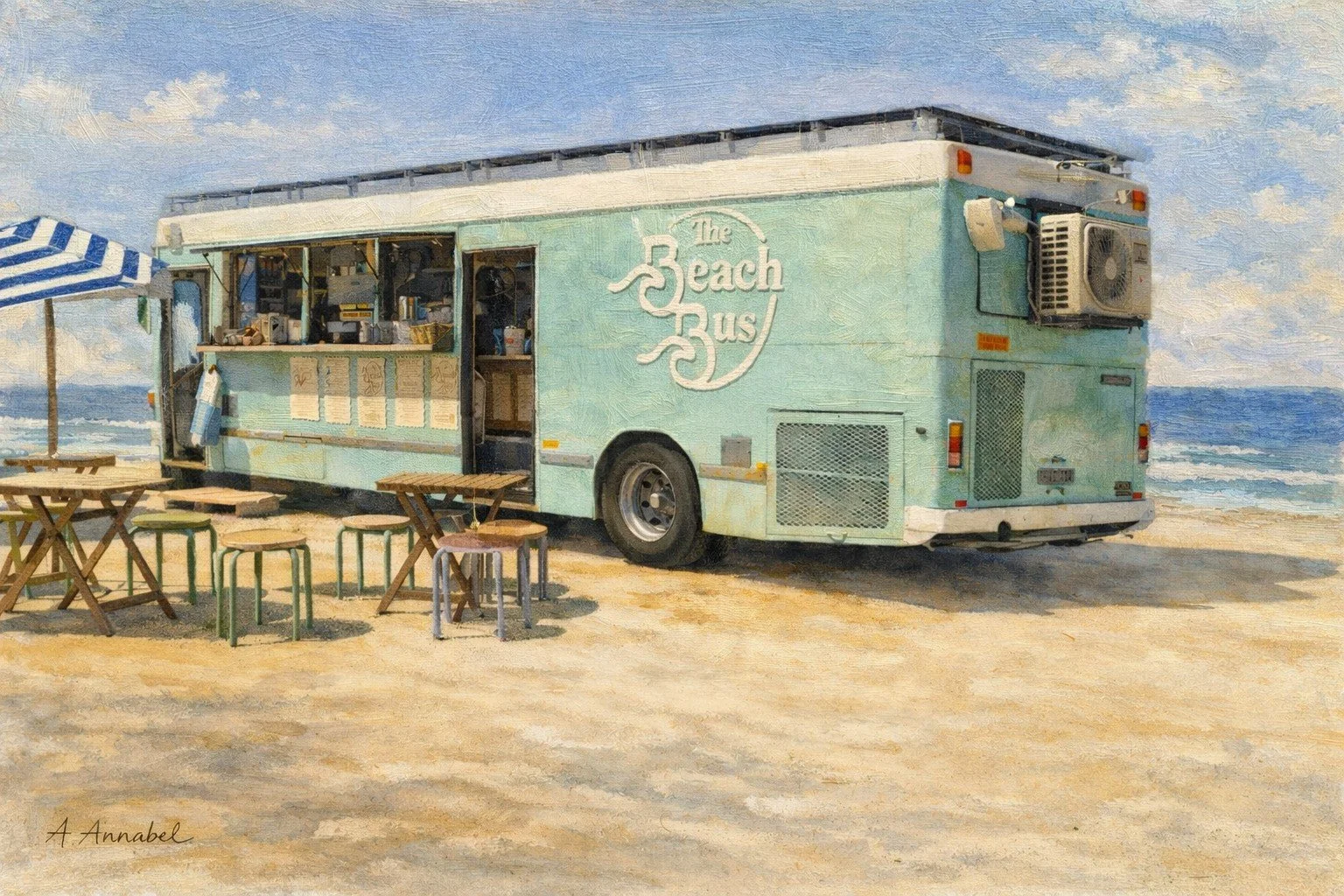
Beach Bus Brew is a gentle, feel-good coastal artwork that captures a quiet moment at a seaside coffee van. A soft mint-green bus sits on the sand, serving coffee from its open servery window, with simple timber tables, stools and a striped beach umbrella nearby. In the background, waves roll in under a clear blue sky.
The softened brushwork and slightly nostalgic palette turn an everyday scene into something quietly uplifting. There is enough detail to enjoy—the hand-painted logo, the coffee cups, the shade of the umbrella—yet plenty of open sand and sky so the image never feels busy or cluttered. It feels like the first calm coffee of the day, with the ocean just a few steps away.
Digital Download
Instant access after purchase
High-resolution file suitable for printing
You will receive high-resolution digital files sized for popular print formats, so you can print and frame the piece at a scale that suits your space and printing options (up to 50×70cm.)
See Shipping & Returns for details.
Ideal for:
therapy rooms
bedrooms
quiet living spaces
work environments requiring sustained focus
This piece is ideal if you want to bring a relaxed, coastal café energy into your space: a reminder of slow weekends, salt in the air and unhurried conversations. It pairs beautifully with other seaside works in the Recalibrate & Exhale collection, especially coastal dunes, shoreline and “quiet vehicles” pieces.
“Want more like this? See the Coastal Calm Collection ”
Learn more about how visual environments affect stress in our 👉 Science behind Calm PDF (Free)
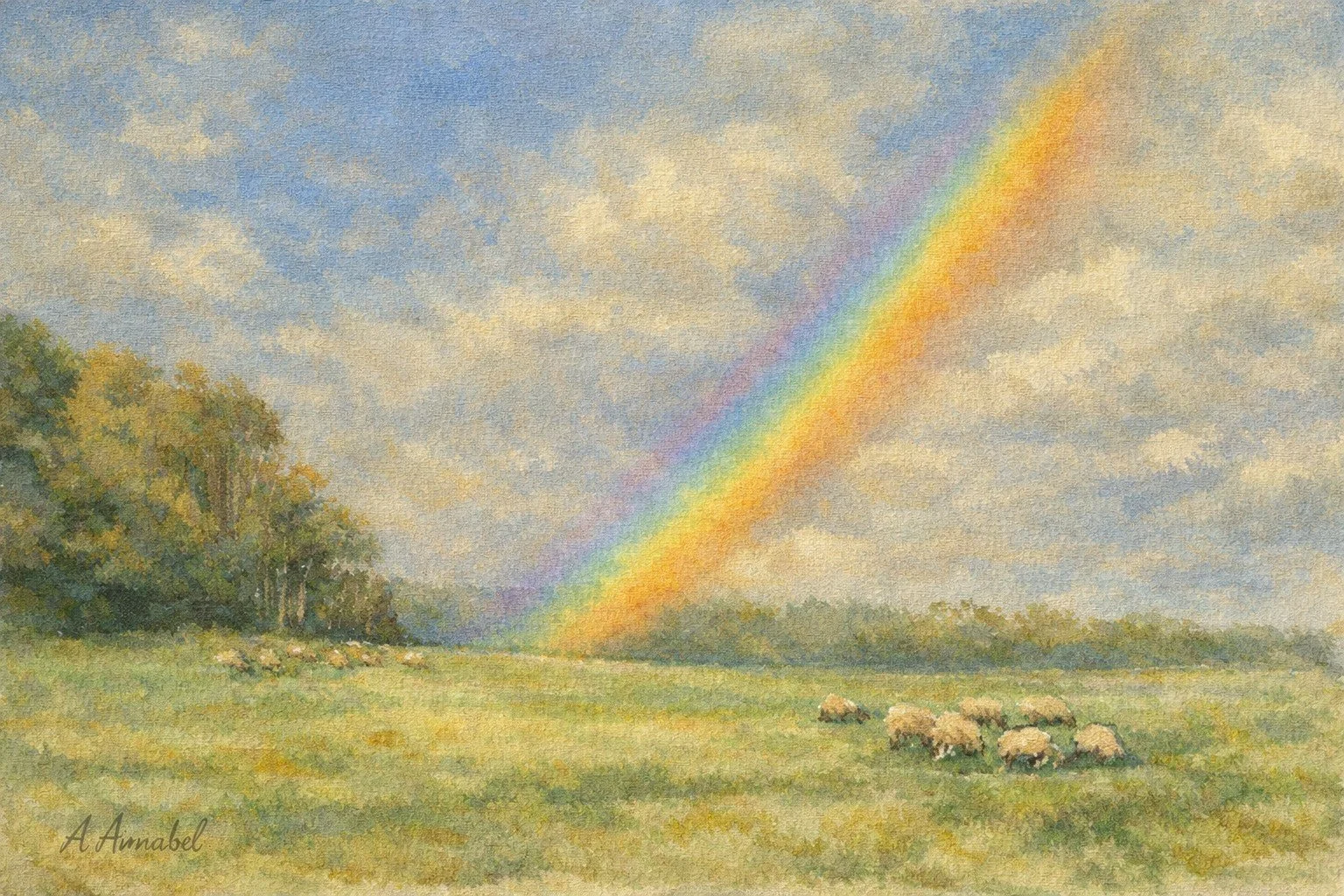
Rainbow After Rain captures the quiet, hopeful pause that follows a passing storm. A soft band of colour arcs across an open sky, pouring down into a sunlit pasture where small flocks of sheep graze calmly. On the left, a stand of trees anchors the scene; on the right, the horizon curves gently away, leaving generous breathing space in the sky and grass.
Painted in the gentle, painterly style of the Recalibrate & Exhale collection, this piece is about exhale moments and subtle uplift rather than drama. The rainbow is clear and luminous but softly edged, blending into a sky of layered blues, creams and sandy greys. The pasture is built from loose, transparent washes of green and gold, with just enough detail in the sheep to feel alive without pulling the eye into over-stimulation.
The composition deliberately leaves a large, open expanse of sky and field so the gaze can move slowly, helping the nervous system settle. The diagonal sweep of the rainbow guides attention from top right down to the distant treeline and then gently back across the grazing sheep, creating a calm visual loop.
Colours are kept warm and reassuring: clear sky blues, muted greens, soft straw and honey tones, with gentle shadows in the trees and along the ground. Both the watercolour and oil-style versions keep edges soft and brushwork visible, so the scene feels atmospheric rather than photographic. A small, elegant signature “A Annabel” sits in the lower left corner, harmonising quietly with the pasture.
Digital Download
Instant access after purchase
High-resolution file suitable for printing
Print at home or through a professional service
You will receive high-resolution digital files sized for popular print formats, so you can print and frame the piece at a scale that suits your space and printing options up to 50×70cm.
See Shipping & Returns for details.
Ideal for:
therapy rooms
bedrooms
quiet living spaces
work environments requiring sustained focus
“Want more like this? See the Water Themes Collection ”
Learn more about how visual environments affect stress in our 👉 Science Science behind Calm PDF (Free)